OVERVIEW
As a designer, and moreover as a person, I firmly believe a well-rounded collection of experiences and a diverse background are imperative to shaping your continual development. Thus, I am always looking for new adventures in life and welcomed challenges in my career. When the opportunity to work with Paul Mitchell came about, I was excited to explore unchartered creative territory. Up to that point I’d worked with brands which tend to cater to a predominantly male demographic: Sony, Nike SB, adidas and the likes.
Getting outside of my comfort zone to design for products geared primarily towards women forced me to open up and rely on a different part of my brain. While extremely challenging at first, it turned out to be a career defining move as it took my creative strategy to another level.
ROLE: Art Direction / Branding / Photo Direction / Packaging / Graphic Design
HOLIDAY BOXES
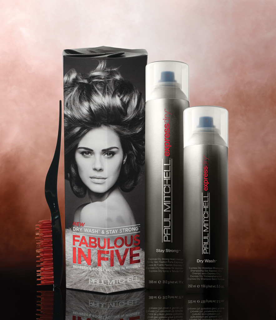
The very first project I was tasked with was to design the Holiday Gift Set packaging for the Paul Mitchell core product line. Admittedly, I started off on the wrong foot, going down every cliched path that attempts to scream of luxury indulgence: lace wrapped boxes, mirrored surfaces, ribbons, excessive filigree and decorative foils. The problem being, these designs would undoubtedly look like every other competitor’s gift set, thus blending into the oversaturated market.
In order to stand out from the boxes they’d be sharing shelf real estate with, I knew I had to think outside of the box (pun intended).
Women already know what they’re buying for a friend, relative or themselves. They know what they want and they already trust the Paul Mitchell product line. They’re not the problem. Men, on the otherhand, are uterly clueless. I can say that because I know firsthand. I’ve been paralyzed by indecision in quite a few beauty sections as I try to figure out what could possibly be the difference between clarifying shampoo and standard shampoo; conditioner vs leave-in condition. Ultimately, I just give up and opt for the ever-impersonal gift card. It’s a common occurrence and the very reason the gift card industry continues to thrive.
So, how do you cut through the noise and stand amongst the crowd?
In order to come up with a viable solution, I first had to identify the problem. I pictured a husband aimlessly wandering the aisles asking himself what on earth do I get her, she already has everything? He likely left gift buying to the last minute (even though he swore he’d never do it again last year). Traffic is insane. Lines are long; getting longer. Shelves are quickly becoming barren. Panic begins to creep in. Suddenly, in the midst of a cold sweat and headed for the gift card end-cap, he stumbles upon a message from the Beauty Gods speaking directly to him:
This is what you buy
the girl who has everything
The clean, purposely-stark simplicity looks unlike anything else in the aisle, so it must be superior, right? Doesn’t matter. The end result is that you’ve interrupted someone’s procedural memory and grabbed their attention. Mission accomplished.
The gift sets proved to be the most successful in the brand’s esteemed history, selling out completely by Black Friday. While the creative strategy was certainly a risk, it was successful because it was a calculated risk. It took some convincing to get the higher-ups on board with such an extreme departure from the status quo, but they inevitably came around because every element, or lack thereof, was backed by clear objectives and a strategic purpose.
We toyed with a Day of the Dead motif, an Aztec inspired approach, a B-Movie horror poster, henna-inspired patterns and dozens of others which ended up in the recycling bin. While each had it’s perks, they all were missing something. But what?
After nearly settling on one of those subpar ideas, I left my desk for the day feeling disatisfied. After getting some fresh air on a hike followed by dinner and drinks, I had a much needed A-ha moment. My thought was to pay tribute to the company’s founder, John Paul DeGoria, and his love of all things from the 1950’s, including classic cars and mid-century furtniture. The cars led to the embossed metallic logo while the packaging payed homage to the home appliances of that era: raw, corrugated cardboard screen printed with mixed typefaces and mechanical line drawings.
Equal parts excited and relieved, I powered up my computer around midnight and worked straight through the night, sending in the final design you see here as the sun rose over the San Jacinto Mountains, just in time for our 10am deadline.
These irons became the fastest selling limited edition release in the company’s storied history. I had reserved one of each colorway for my portfolio, but was forced to release them due to public demand. With no other option, I eventually turned to eBay, where the price had more than quadrupled from the suggested retail price of $75 to an inflated $325.


