Overview
Typically when I’m brought onto a project, it’s either to craft memorable brand identity for an upstart or to reinforce and revitalize the existing identity of a well-established brand. BURGERFI fell somewhere inbetween. Three years into their existence, they knew they could no longer continue to support their rapidly expanding franchised chain with lackluster identity, subpar branding and a lack of effective marketing.
I jumped at the opportunity to change all of that. When I say all of that, I mean quite literally all of that. Every piece of existing branding had to be reimagined and redesigned. A massive undertaking indeed.
ROLE: Creative Direction / Copywriting / Branding / Photo Direction / Packaging / Interactive
- The abundance of burger icons.
- The overuse of stars.
BURGERFI had both. If we were going to stand out, which is the purpose of effective branding after all, it wasn’t going to happen being lumped in with all of these guys:
The first step was to eliminate the burger. Considering we have the word ‘burger’ in our name, the icon felt redundant. Next went the star. To me, it felt like we were saying our quality was only worthy of a 1-star rating, when in fact we had food that rivaled that of fine-dining establishments. That high quality food — never frozen, no hormones or antibiotics, everything made from scratch, chef-inspired — is what sets BURGERFI apart, and thus should be represented in the logo. I landed on a logo that has a chef’s knife slicing through a ‘B’, effectively creating a ‘B/F’.
BEFORE & AFTER
—
In order to keep rebranding costs as low as possible, I kept the existing font in order to repurpose signage and to not deviate too far from the established branding across 70+ locations. In addition, I dropped the tagline from the logo. With the word ‘burger’ already letting customers know what we primarily serve, the tagline was superfluous and only distracted from the company name itself. Not to mention, if we properly execute our marketing and social media there should be no need for any additional explanation of what we do.
BEFORE & AFTER
Graphic Elements
Given the immense pride and elbow grease put into every aspect of the company from the outset, I felt each of the key differentiators was deserving of a hand-tailored graphic that highlighted those efforts. Serving as badges of honor, these graphics tout our menu items, green initiatives and brand messaging.

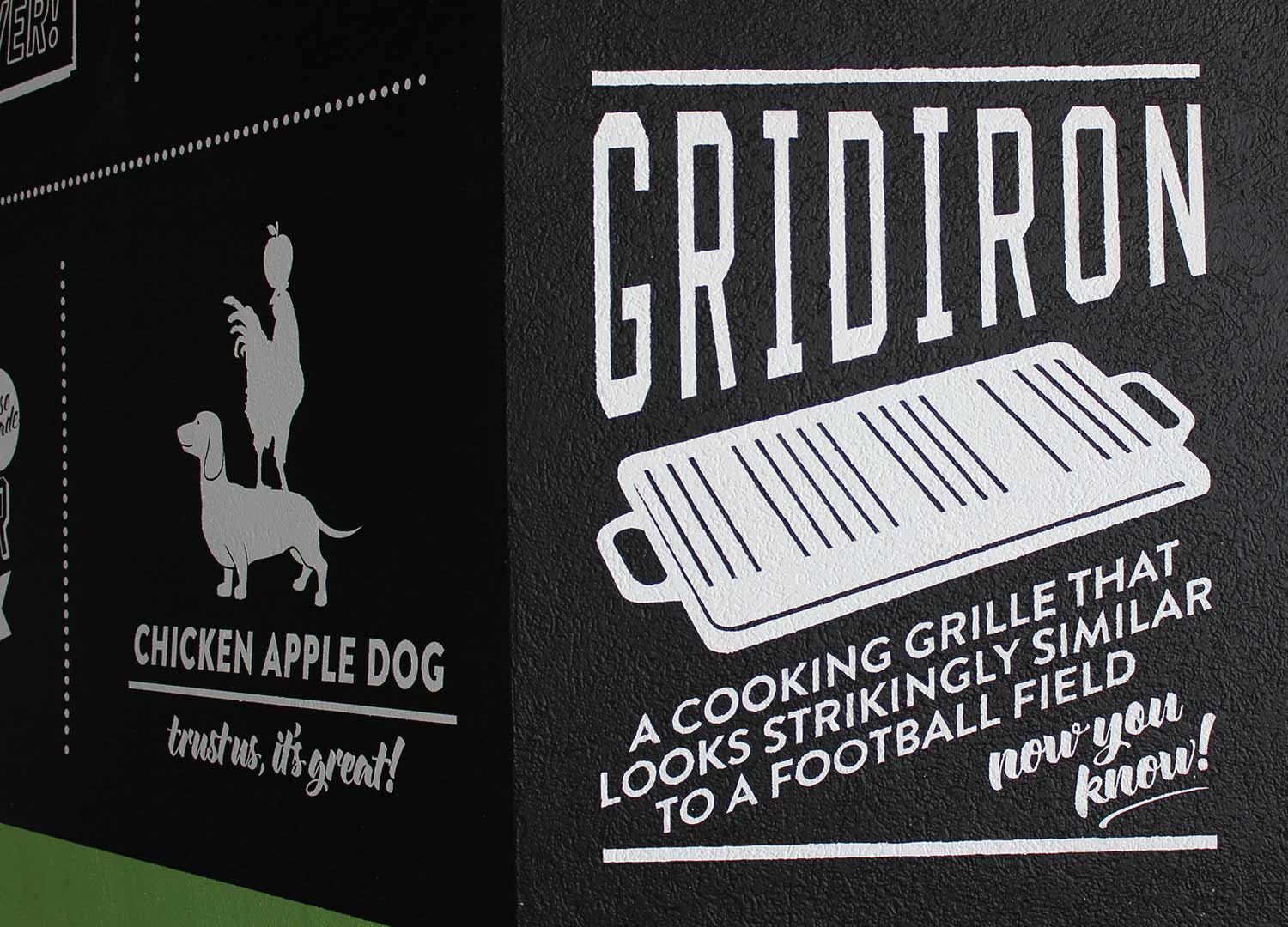
The easy route would have been to wrap the entire facade in printed vinyl and have it fully installed in a matter two days, three tops. However, the synthetic material felt off-brand and blended in with the rest of the vinyl-wrapped, formica-clad concessions throughout the stadium. Instead, we elected to cover the entire stand in matte black and painstakingly hand-paint our graphic elements, resulting in two weeks of sixteen hour days. The time-lapse video I shot and edited above condenses the madness into a concise two minutes. Look closely and you’ll see me getting my hands dirty, as it was all hands on deck.
Opening weekend saw upwards of 200,00 fans over three days
Without the luxury of a dry run or soft opening, we jumped right into a 3-day opening weekend that hosted a Friday night soccer match between the national teams of Brazil and Colombia, followed by a University of Miami football game Saturday afternoon and topped off with the Dolphins season opener versus the rival New England Patriots. All total the weekend saw upwards of 200,000 fans, with lines wrapping around the stand and down the concourse, leading BURGERFI to generate more sales in the opening weekend than the previous occupant of the space generated the entire season prior.
EMBRACING THE CONSTRAINS
—
When taking on a project of this scale, you will inevitably face a number of obstacles, corporate & legislative mandates, and many less-than-ideal scenarios. You can either counterproductively pout and stomp your feet, or you can embrace the constraints and come up with a creative workaround.
Such was the case when we encountered an immovable fire alarm smack-dab in the middle of a massive concrete support column — arguably the most visible surface in the entire concession space we were taking over. Instead of trying mask it or ignore it, I came up with a way to incorporate it into the design and created a humorous, unexpected brand touchpoint. Sure enough, it was photographed and shared on social media more that any other part of the design.
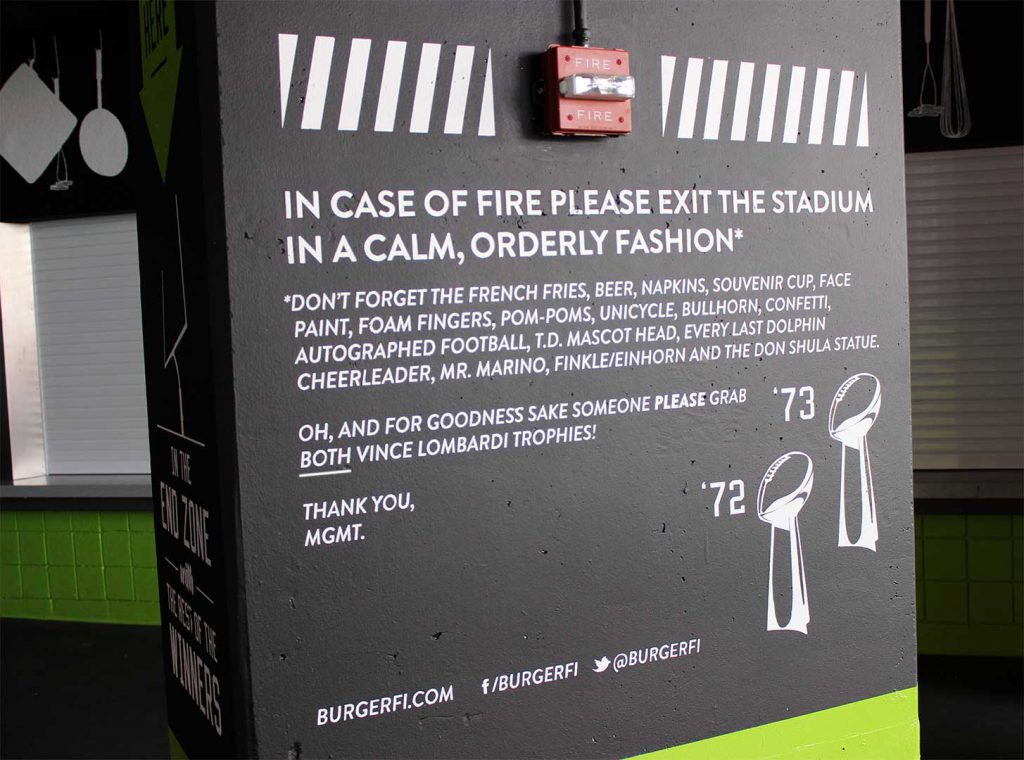
I can go to the grave knowing I’m the first (and only) person to get the Miami Dolphins to sign off on any kind of Ace Ventura reference
Building on the success of the first season, BURGERFI signed on for an additional three concessions spread throughout Sun Life Stadium. As part of their massive 2-year renovation plans, all concessions were to be gutted and refaced. BURGERFI was the only corporate partner consulted for design input. Further evidence of just how solid of a partnership we’d already built.
—
CLICK IMAGES
to ENLARGE
I continually referenced the phrase ‘perfectly imperfect’

New Campaign
Companies love to shout from the mountain top how great they are. We’re the best! Voted number one! Best in town! Better than the other guy! But how often can they actually back those claims? Considering taste is subjective, you’ve already lined yourself up for disappointment by claiming you’ll surpass someone’s expectations.
Instead, what if we touted all the things we’re not? All the things we made a concerted effort to omit? All the things you’ve grown accustomed to finding in most burger joints, but won’t find at BURGERFI.
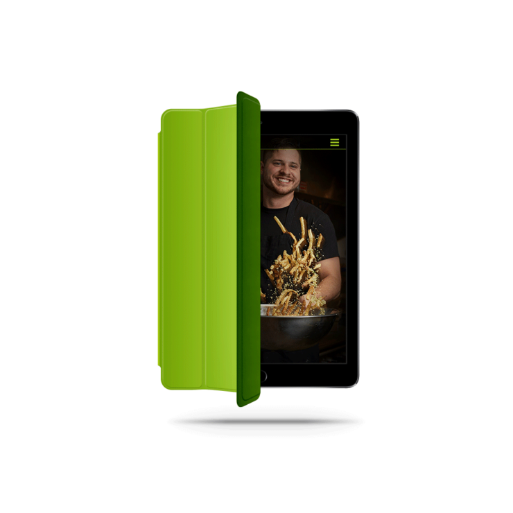
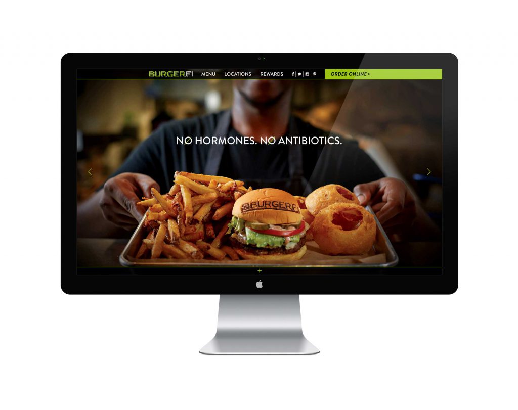
BURGERFI.com
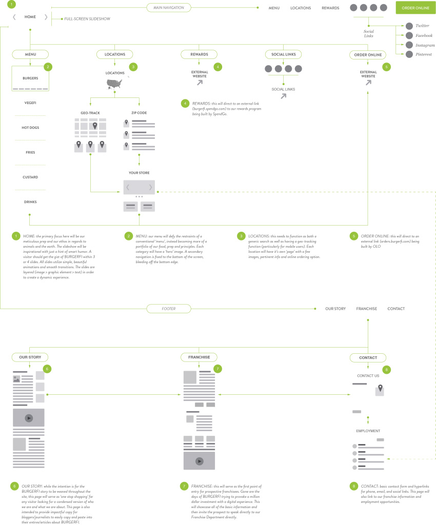
Falling in line with the rest of the original direction, BURGERFI.com was a shining example of how not to build a website. Overly complicated and lacking any kind of wire-framing or flowchart, the site was a series of dead ends and unorganized content. The excessive navigation was repeated in the header and footer, meaning there was no hierarchy to the U/X and the lack of a sticky header meant visitors were often exploring the site without a road map always accessible.
We started with simple questions like What is BURGERFI? – and – Why do people visit BURGERFI.com? The answers: BURGERFI sells hamburgers and visitors want to know what we serve and where they can get it. That simple. They’re not there to open a franchise or learn who our corporate team is or even to view our social media content (they’ll go directly to those sites for that).
As elementary as this all may seem, the straightforward answers told us everything we needed to know in deciding what occupied our primary navigation, what we reserved for our secondary navigation and how we organized/presented our content. The collective legwork made the wire framing and flowchart process inevitable, meaning how could it not be organized this way?
.
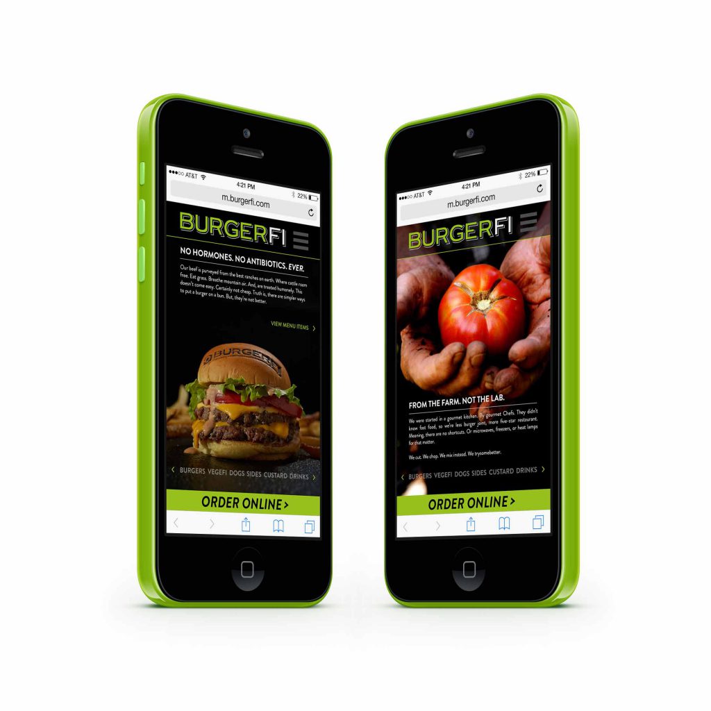

Online Ordering
I’m a firm believer in partnering with experts to handle certain aspects of a given project. When it came to revamping BURGERFI’s broken online ordering system, we turned to OLO (Online Ordering) to help us understand best practices and to build a state-of-the-art system that could handle not only the abundance of orders generated by 70+ current locations, but have the scalability to handle the hundreds of projected openings on the horizon.
Reliable, fast, and secure, OLO integrated flawlessly with BURGERFI’s existing POS Systems, Payment Providers and Loyalty Program. Easy for customers and even easier for operations, Olo provided great tools like GoTime™ Hold & Fire to accurately schedule each order based on the actual make time. The end of cold, soggy fries as we know it.
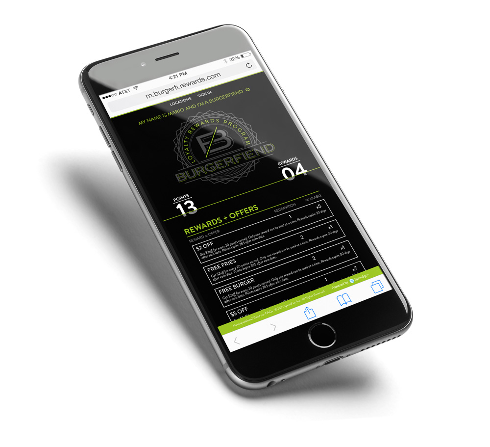
 One service, any device. FI on the FLY is optimized for on-the-go customers who need their BURGERFI fix as hassle free as possible.
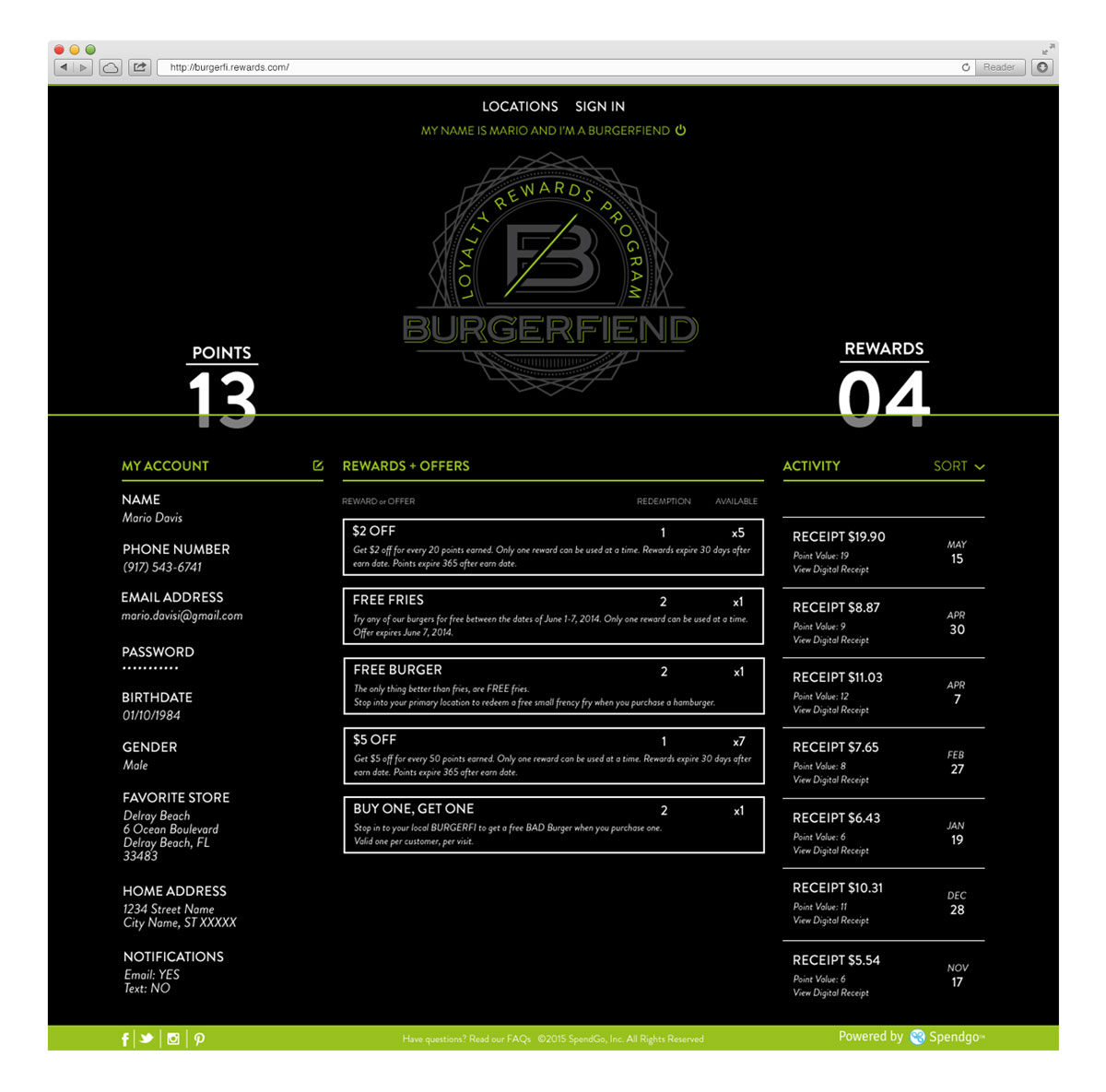
The engaging, user-friendly interface eliminates the complex registration process in favor of a cardless, paperless program. To earn rewards, customers simply enter their number before each purchase. If they have unused point, the system will ask if they’d like to use them.
In addition to earning traditional rewards, members are given occasional surprise-and-delight rewards including a free custard on their birthday and five free points on each yearly anniversary.
